I wish someone told me NEVER to underestimate the work of a designer
“I wish someone had told me” is a series of posts that feed into our inquisitive nature at CN&CO. Each week we hear from someone in our network about something interesting or surprising that’s recently happened or occurred to them – or lessons they learnt. These blogs are a way to pay it forward and form part of CN&CO’s belief that the world can be a better place – and we all have a responsibility to make it so. This week’s post is by Francois Joubert.”
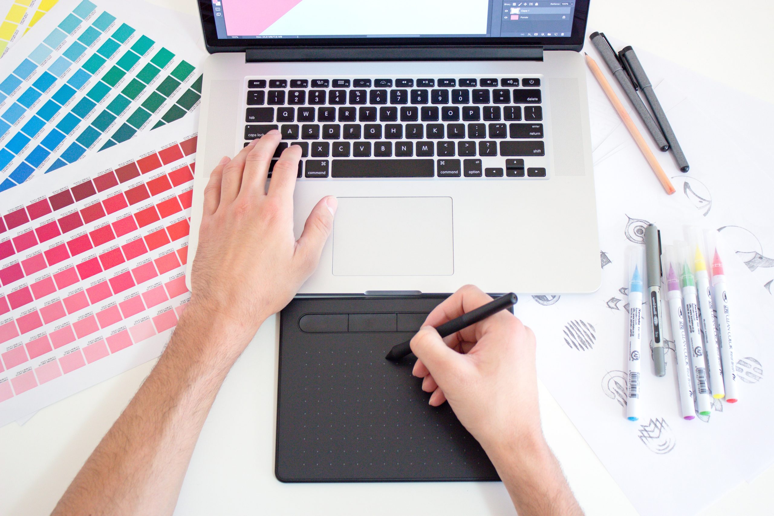
As a self-taught person that dabbles in the world of graphic design, I don’t think I will ever reach a point where I think I’m the bee’s knees and know everything there is to know about graphic design. Furthermore, I am content with the fact that I will most likely never know nor learn everything there is to know about the design software I use and what it can produce- and trust me the latter is very near to limitless. But, the one thing I wish someone told me earlier, is that the art (and an art form it is) of graphic design is underestimated- know this and accept this.
I’ve always naturally gravitated towards design. As a young boy I would sneak into my sister’s bedroom and page through her copies of Elle and Marie-Claire magazine. Yes, the fashion always grabbed my attention, but the way in which the editors and designers mastered the layout, and the interesting design and use of typography always fascinated me more. Now, at the age of 9, I attempted many a time to produce my own magazine layout with Microsoft Word & Paint circa Windows ‘98, suffice to say the latter should ‘paint’ a mental picture of what that ‘attempt’ looked like. Regardless, the fascination of how these editors and designers produced these works of art every month never left me.
Fast-forward to me as an undergrad and making smart choices when it came to choosing subjects. I immediately chose subjects like visual art studies, theatre making and theatre design- and I remember thinking that this would give me access the book of secrets and I finally learn how the masters of design made these masterpieces. Funny enough, I soon discovered that the art of design is based on one fundamental rule: design is the process of making a digestible and coherent sign(s).
The latter (a very paraphrased quote form Swiss linguist and semiotician, Ferdinand de Saussure) comes from semiotics, which is the study of signs. Now, in semiotics we have the ‘signifier’ and the ‘signified’. The ‘signifier’ refers to the physical object which has been given meaning. The ‘signified’, then, is the meaning(s) associated with or given to a sign. Let’s take for example a stop sign: physically it’s a red octagon with the word ‘STOP’ written on it. But, the signifiers are the immediate meanings, associations and reactions we decode in our brain when we see the stop sign. The use of the colour red signifies danger or calls for immediate attention and reaction, and the same goes with the octagon shape which has become synonymous to the STOP sign. All of these things work together to convey an immediate and effective message.
At this point, dear reader, I kindly ask you to read the above paragraph at least two more times and let it simmer while you go make yourself a cup of tea… Have you done it? Promise? I’ll take your word for it.
Now, let’s apply the logic of semiotics to the work a graphic designer. A client asks a designer to create a brand new company logo. Now, this may seem simple: use some shapes, words, colours, an interesting font and voilà you have yourself a logo. If you think it’s this simple, sorry hon’, you’re wrong, you’re soooooo wrong!
Whenever clients ask me to do ANY design job I depend on the client to give me a clear idea and sense of the message they want to convey or signify with the design. It’s then my job to think in and look for colours, shapes, fonts, words, images, icons and move and build a puzzle on a digital canvas to ultimately convey this message, this emotion, something that draws attention and goes and sits somewhere in someone’s vast psyche. And you sit there, behind your computer screen, hoping that your hours of building this puzzle of signifiers made an impact somewhere or moved someone and made them remember it in a way. It’s a process that is so layered and dense, a process that becomes more than just simply adding layers upon layers (designers will get this joke) on this digital canvas. With every placement of an object (or layer) a designer needs to consider how this will be interpreted, how this simple email banner is going to get into the layers and layers of someone’s psyche and create the exact reaction the client wants.
And that, right there, that’s what makes design difficult. That is why when people ask me “Do you think you can quickly design something for me”… Yes, sure, I can design something for you… But the process won’t be always be quick. And the reason is simple: we need to think about A LOT OF THINGS ON A LOT OF LEVELS!
So next time you ask me, or any other designer for that matter, to do work for you, please: a) be kind, b) don’t underestimate the process and c) be understanding when they take a little longer than you anticipated. When designers take a few hours longer with your design, just think that they may have needed those few hours to figure out and build a dense and layered puzzle for your to print, post, email, or market a true masterpiece. Gurl, they don’t call it a digital “canvas” or “ARTboard” for nothing, and we may use a digital brush instead of a real one, but we are in the business to create digital artworks.


I wish someone had told me how amazing bridge is!
"I wish someone had told me" is a series of posts that feed into our inquisitive nature at CN&CO. Ea

I wish someone had told me that going to gym really isn’t a painful exercise
“I wish someone had told me” is a series of posts that feed into our inquisitive nature at CN&am

I wish someone had told me about The Daily podcast
This is the story of how one podcast reminded me of the fundamental need for human connections.